Join the Movement
Movement is project44's flagship real-time supply chain visibility platform. Customers use it to track their shipments across modes (like trains, planes, trucks, and ocean) in any region, all in one place.
Before Movement, users were required to navigate between multiple platforms—even texting truck drivers directly—to understand where their shipments were. Movement solved this logistical minefield.
As Principal Product Designer, I steward the design vision across Movement and establish standards and patterns for our design system.
Planning for the future
Movement needed to be designed, built, and launched on an expedited timeline. As such, its visual language at launch was largely zhuzhed up design systems borrowed from other project44 platforms.
6 months post-launch, my role was to push Movement’s design language into a class of its own, governed by three design principles:
- Movement is calming: Foster an environment that makes stressful, time-sensitive work feel steady and predictable.
- Movement is tactile: Design an interface than functions like high-quality hardware, while keeping healthy distance from skeumorphic design cues.
- Movement is precise: Build to exacting tolerances and strictly follow the rules we set for ourselves on spacing, dimensions, layout, etc.
-
Movement at launch: Make better use of space for more data and improved legibility.
-
Movement at launch: Data is nested within so many containers and surfaces, making it hard to understand the content hierarchy.
-
Movement at launch: The site navigation quickly breaks down after traveling just a couple of levels into the app's IA (information architecture).
Reviewing the current state
Movement's design at launch had ample opportunity for improvement. As design lead, I narrowed in on four key addressables:
- Navigation and IA: The global navigation was no longer sophisticated enough for the growing app.
- Data density: Page layouts consist of many container-in-containers, and larger font sizes sacrifice valuable screen space and decrease legibility.
- Too much blue: Movement's over use of blue across navigation, sidebars, links, badges, tags, buttons, and more rendered the color meaningless, and key functionality was lost.
- Dead ends: Users frequently hit dead ends that forced them to go back or start over from a different top-level area.
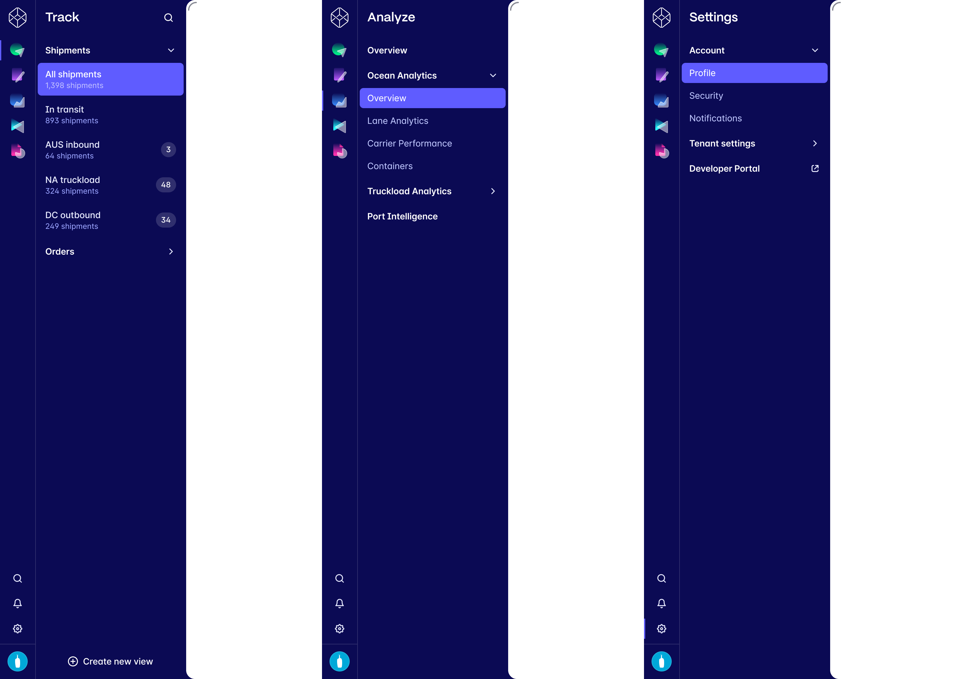
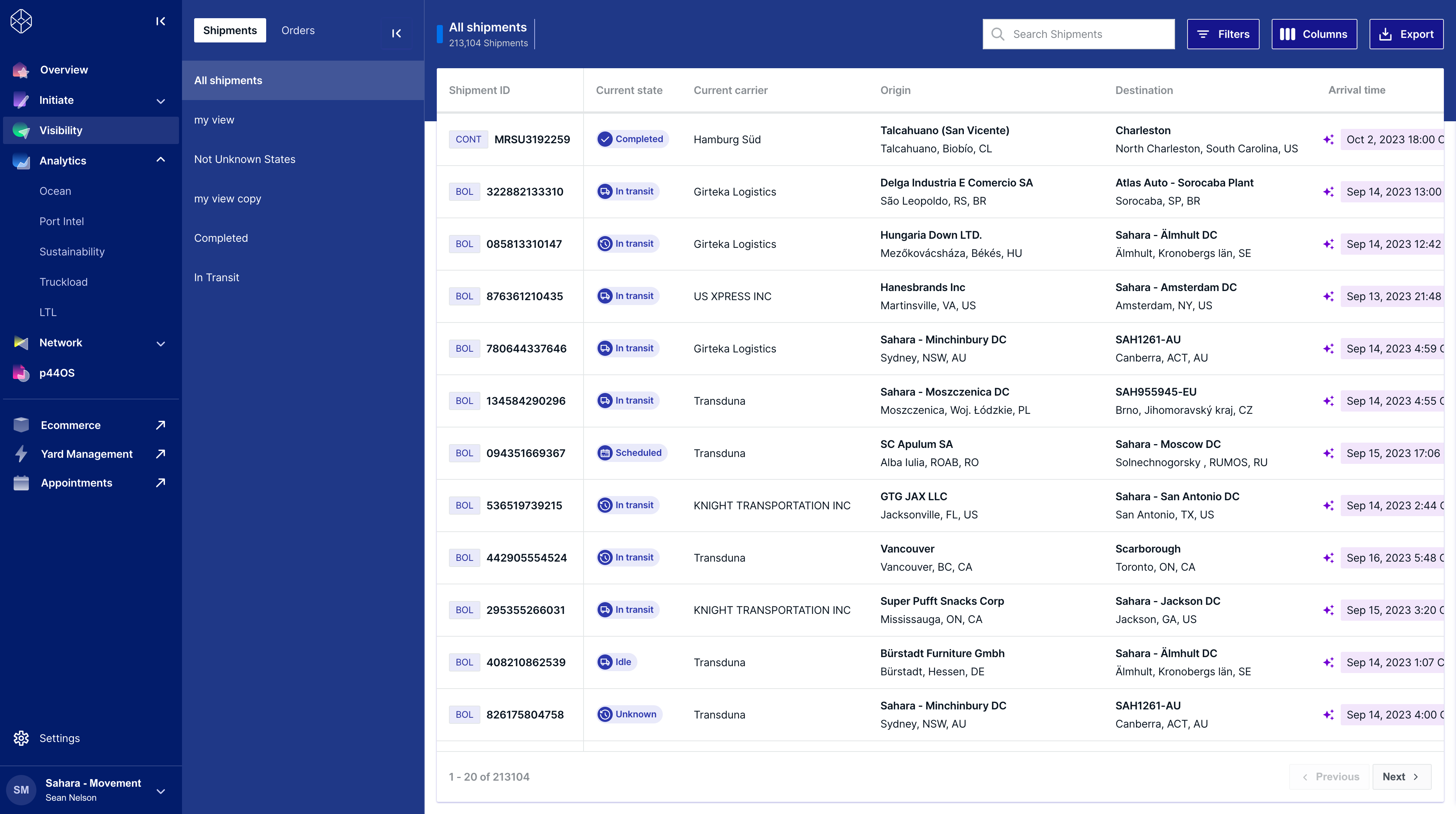
Addressing the navigation
It was critical to reevaluate Movement's foundation, starting with the app's IA and navigation. The original sidebar did a lot of heavy lifting—displaying both top-level product destinations as well as product areas within.
Dividing the global nav into two areas—a persistent product switcher and expandable/collapsible contextual sidebar—was more space efficient and allowed for a third level of hierarchy that was otherwise addressed with a local tab bar.
-
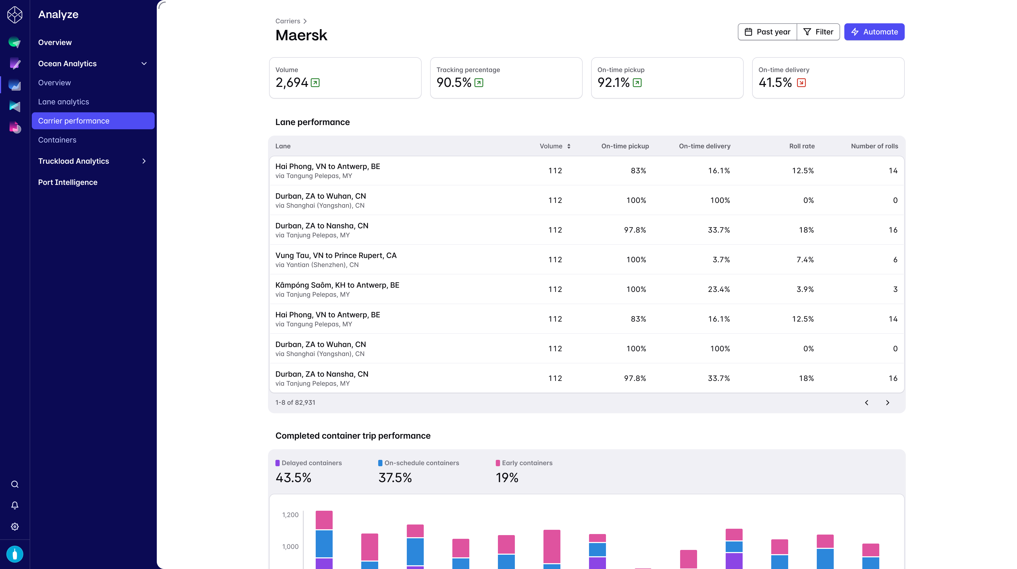
Movement redesigned: Improved navigation, a stronger typographic scale, and narrow column layout reduce distration and increase scanability.
-
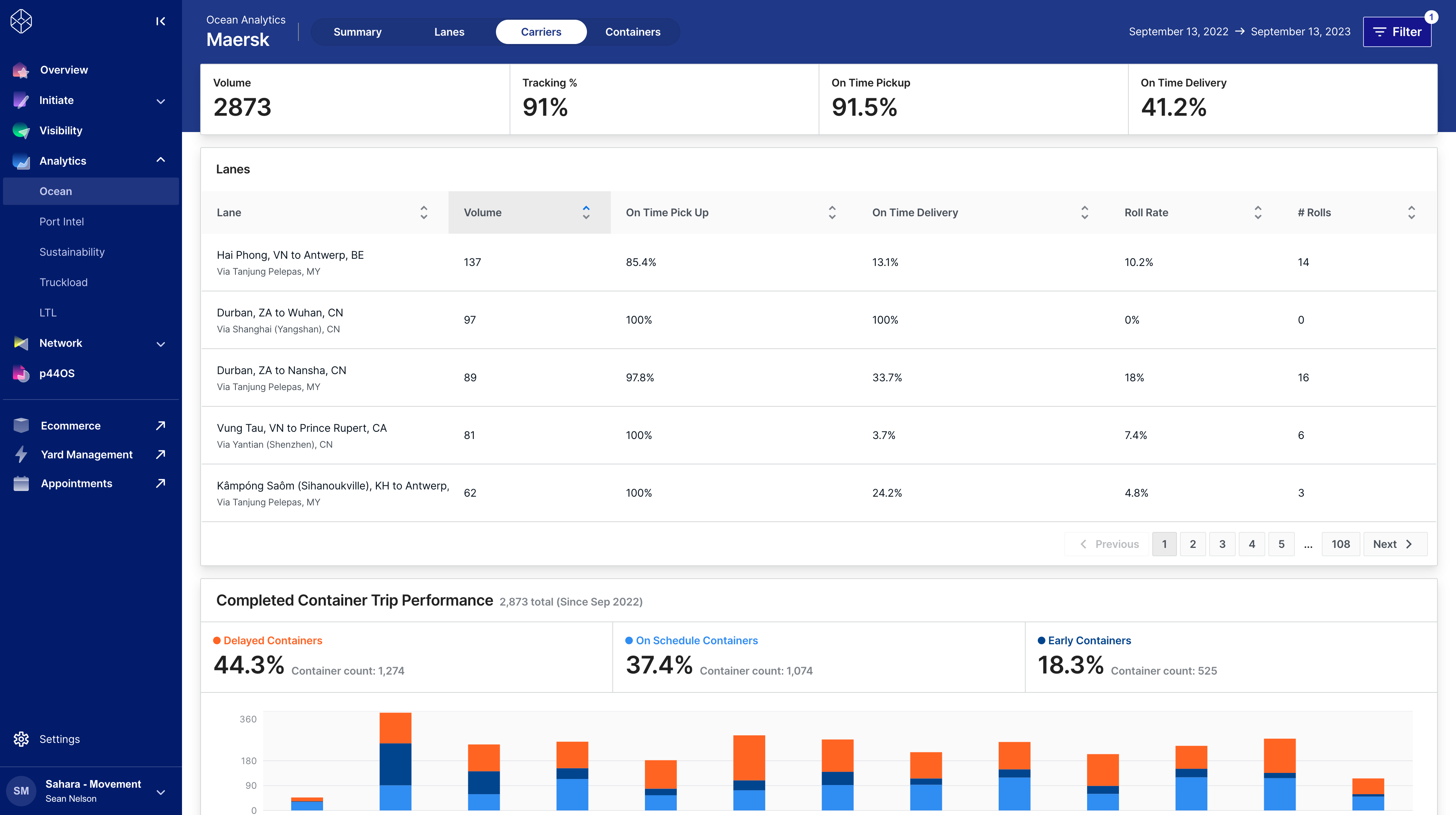
Movement at launch: Heavy drop shadows, full-width containers, and a dark header make this page feel oppressive and hard to absorb.
Resurfacing the layout
Redesigning the layout began with an honest interrogation of past design decisions. Content and page hierarchies were conveyed by nesting content within containers and cards—contributing the problems with data density.
For Movement's new design language, I created an improved typographic scale that increased legibility at smaller sizes and flattened the surfaces to bring priority back to the content. This way, more information can fit within the viewport with less scrolling.
-
One-column <Layout /> on a full-width <Page />.
-
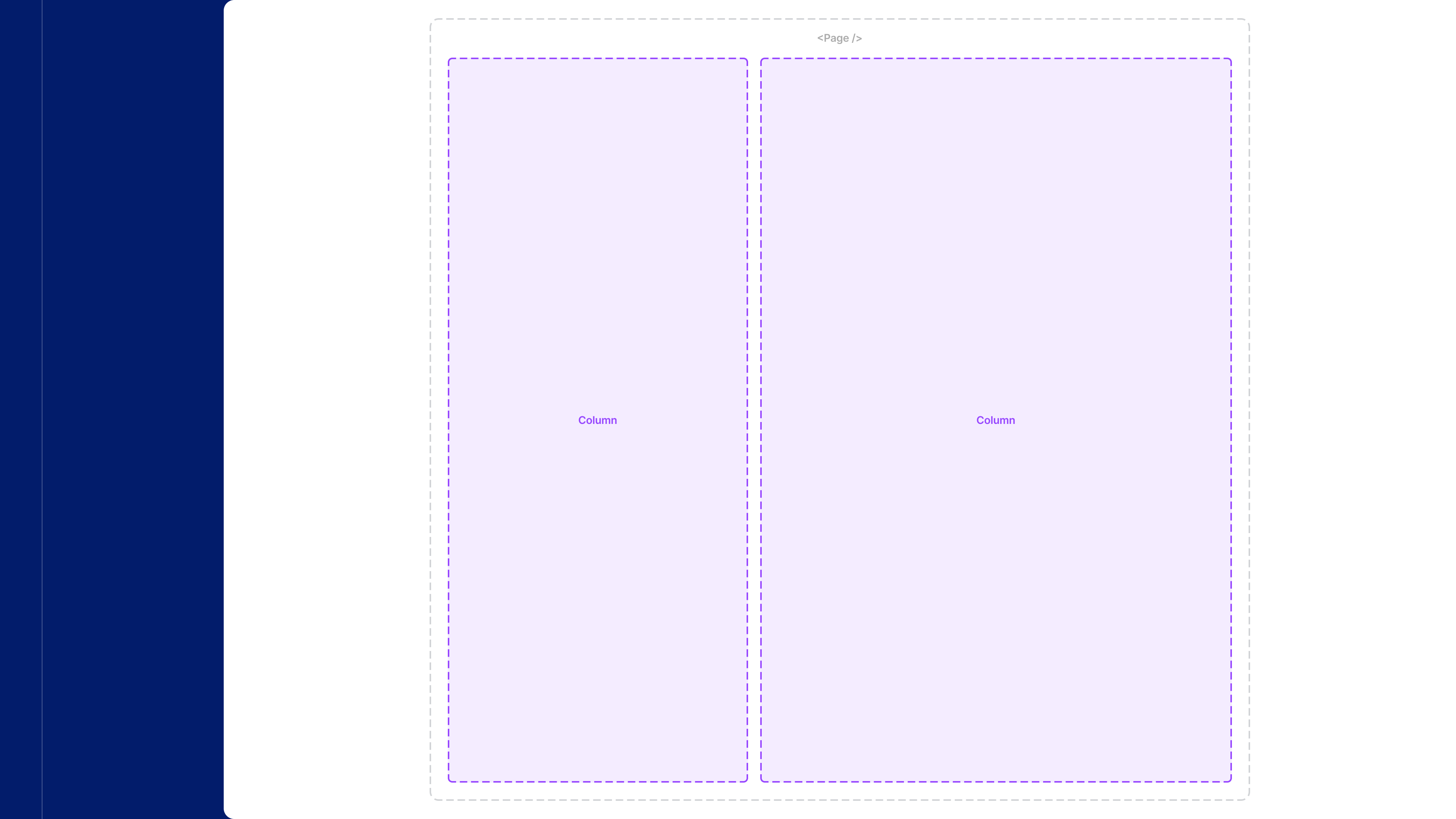
Two-column <Layout /> on a max-width centered <Page />.
-
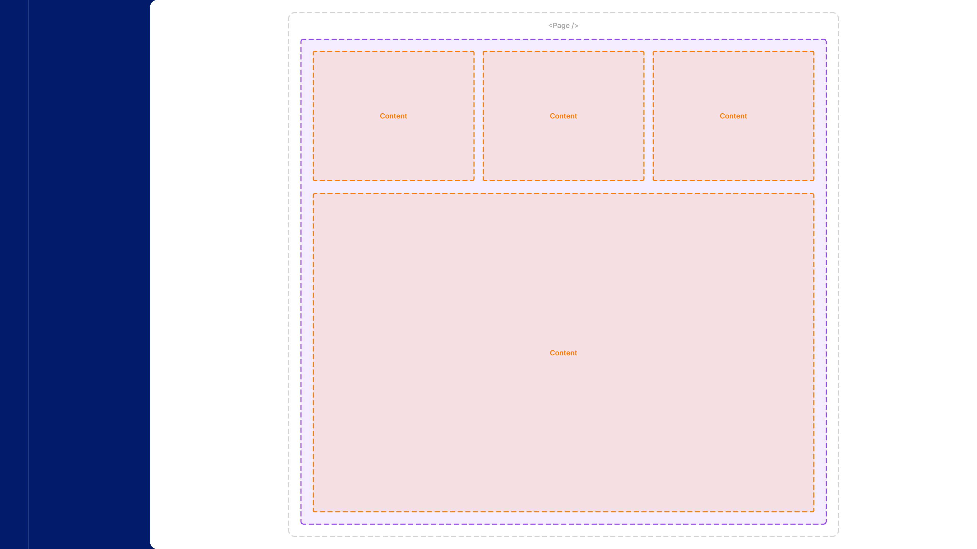
Horizontal and vertical <Stack />s inside a one-column <Layout /> on a centered <Page />.
-
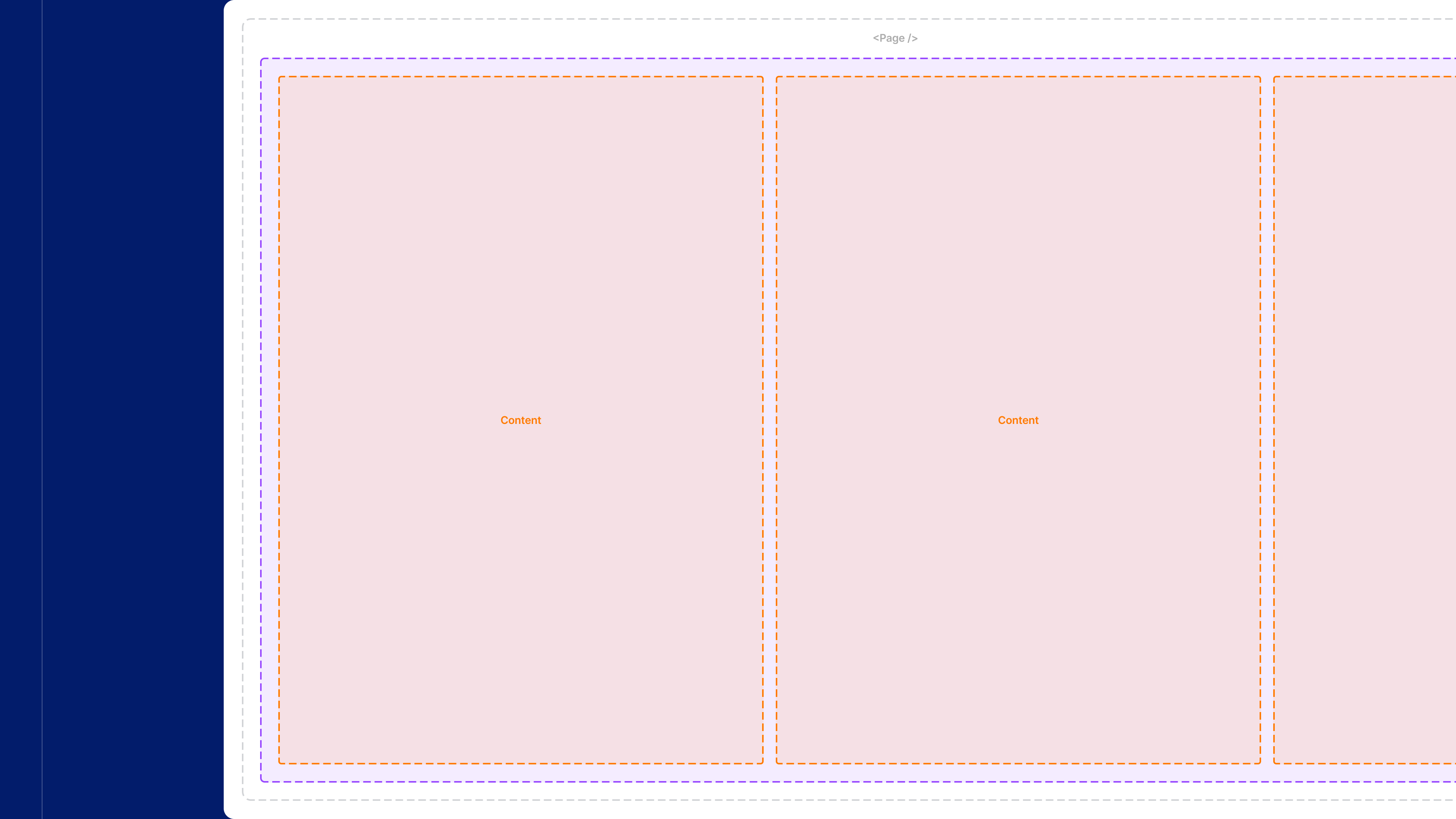
Horizontal <Stack /> inside a one-column <Layout /> on a scrolling-width, 100% height <Page />
-
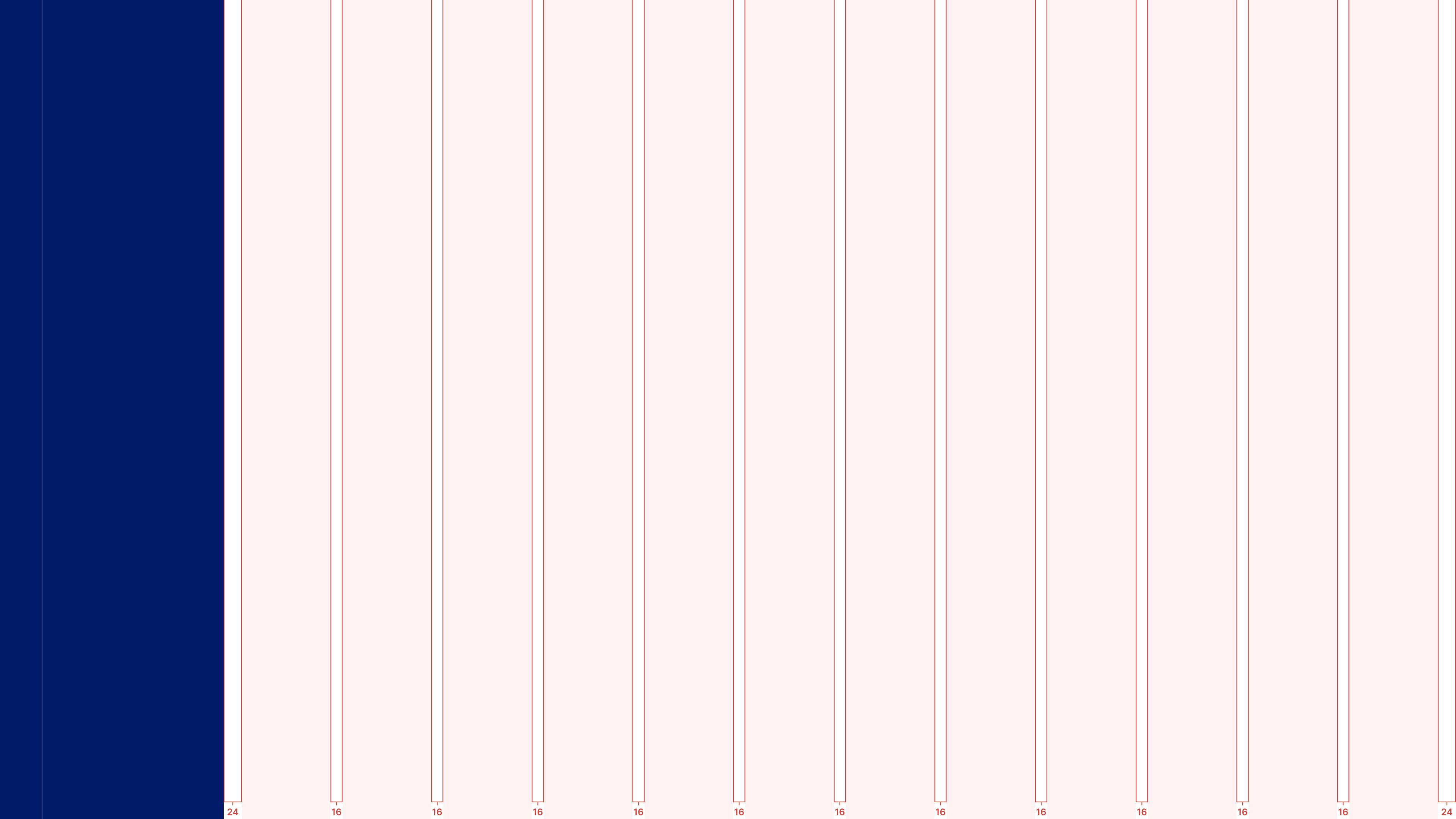
A 12 column grid aligns parent containers within the <Page />
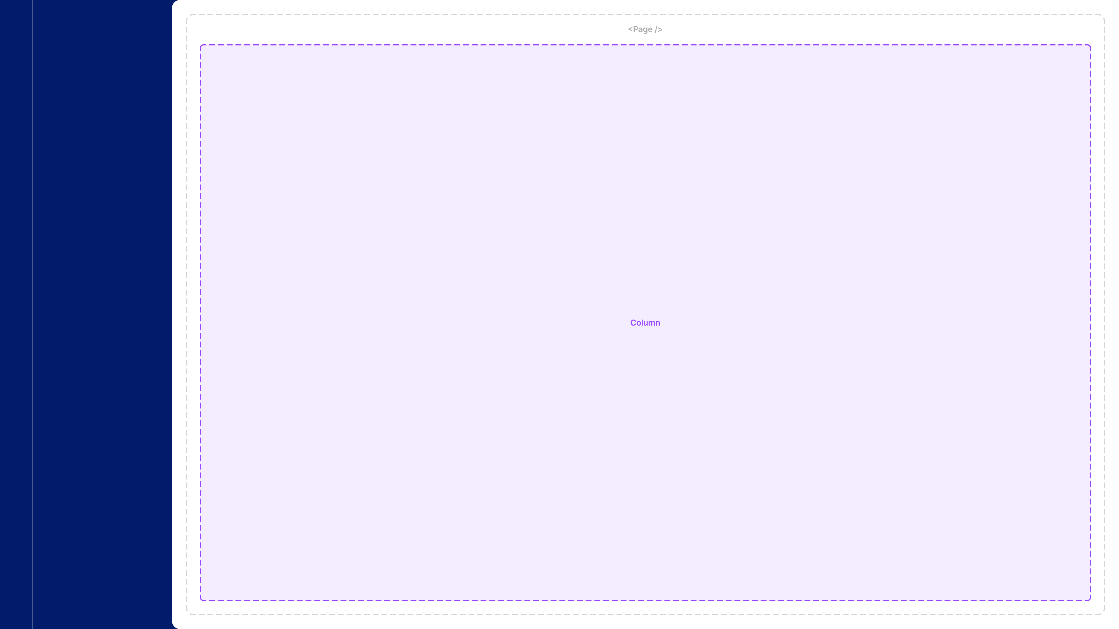
Page anatomy
A pain point for Movement designers and engineers is the lack of page layout and responsive design guidelines. A quick audit of the app revealed Movement heavily relied on 100% width/height layouts. This is appropiate for a number of pages, but cumbersome for most.
I developed a new page architecture, built how engineers would implement using design system componentry.
- <Page />: The Page component manages the main content area in Movement. Configurable props determine full-width or max-width layouts.
- <Layout />: Layout is used to structure content inside a page but otherwise contains no styling or ornamentation of its own. Configure one or two column layouts.
- <Stack />: Stacks are generic wrappers that group content in relation to page layouts. They contain no styling of their own. Stacks can display children horizontally, vertically, or as a grid. Multiple stacks can be used within the same layout.
- Column grid: Spacing and sizing for <Page />, <Layout />, and <Stacks /> are based on a responsive column grid that adapts to the viewport width.
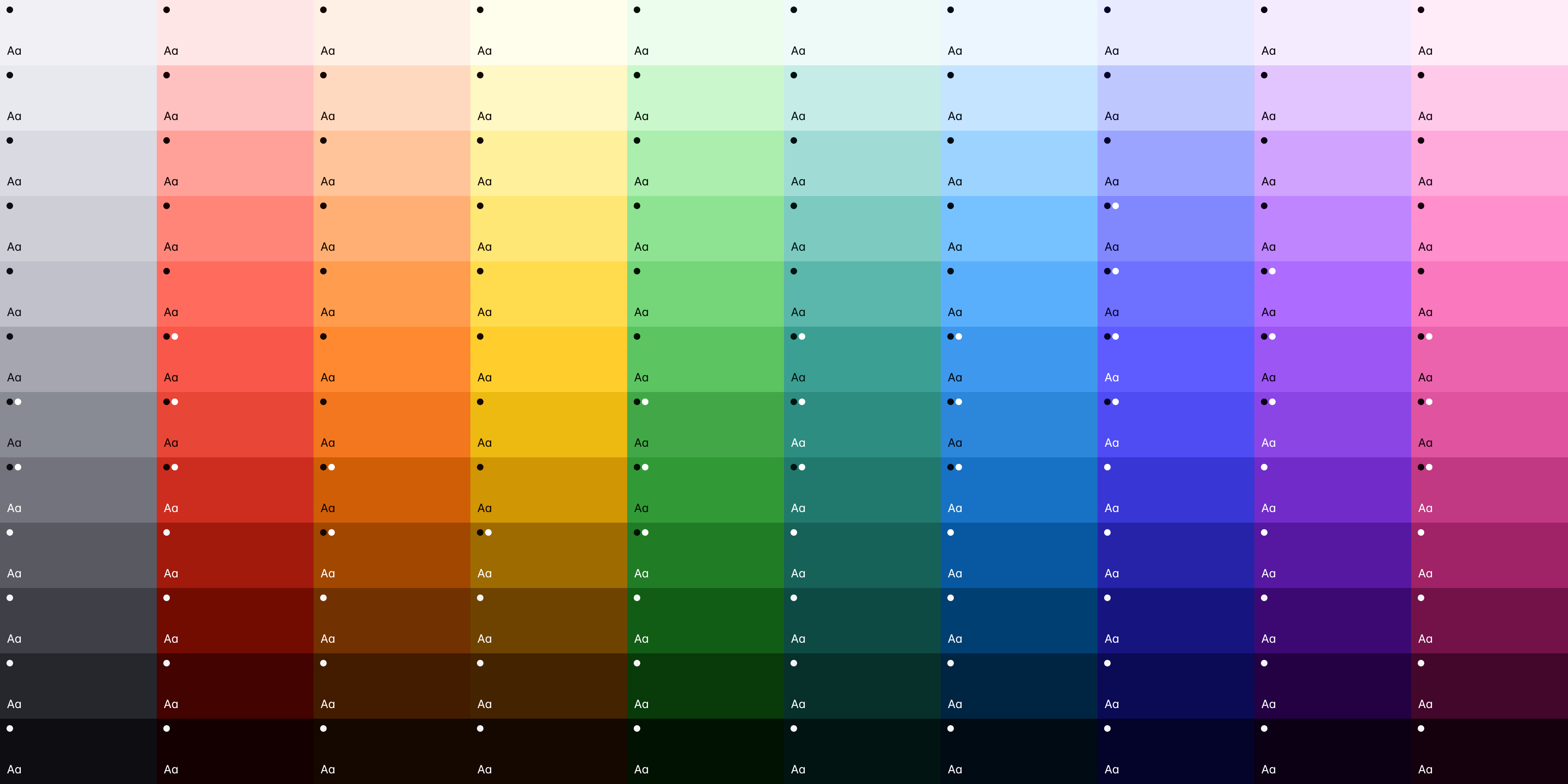
A refreshed color palette
The color palette was refreshed, adding additional values for a more expansive selection. Each value was checked against the necessary 4.5:1 contrast ratio for text-on-color and 3:1 for color-on-color. Our goal is to at least meet WCAG 2.1 compliance.
Selections were chosen to populate additional palettes reserved for data visualization, including Categorical, Sequential, and Diverging options.
-
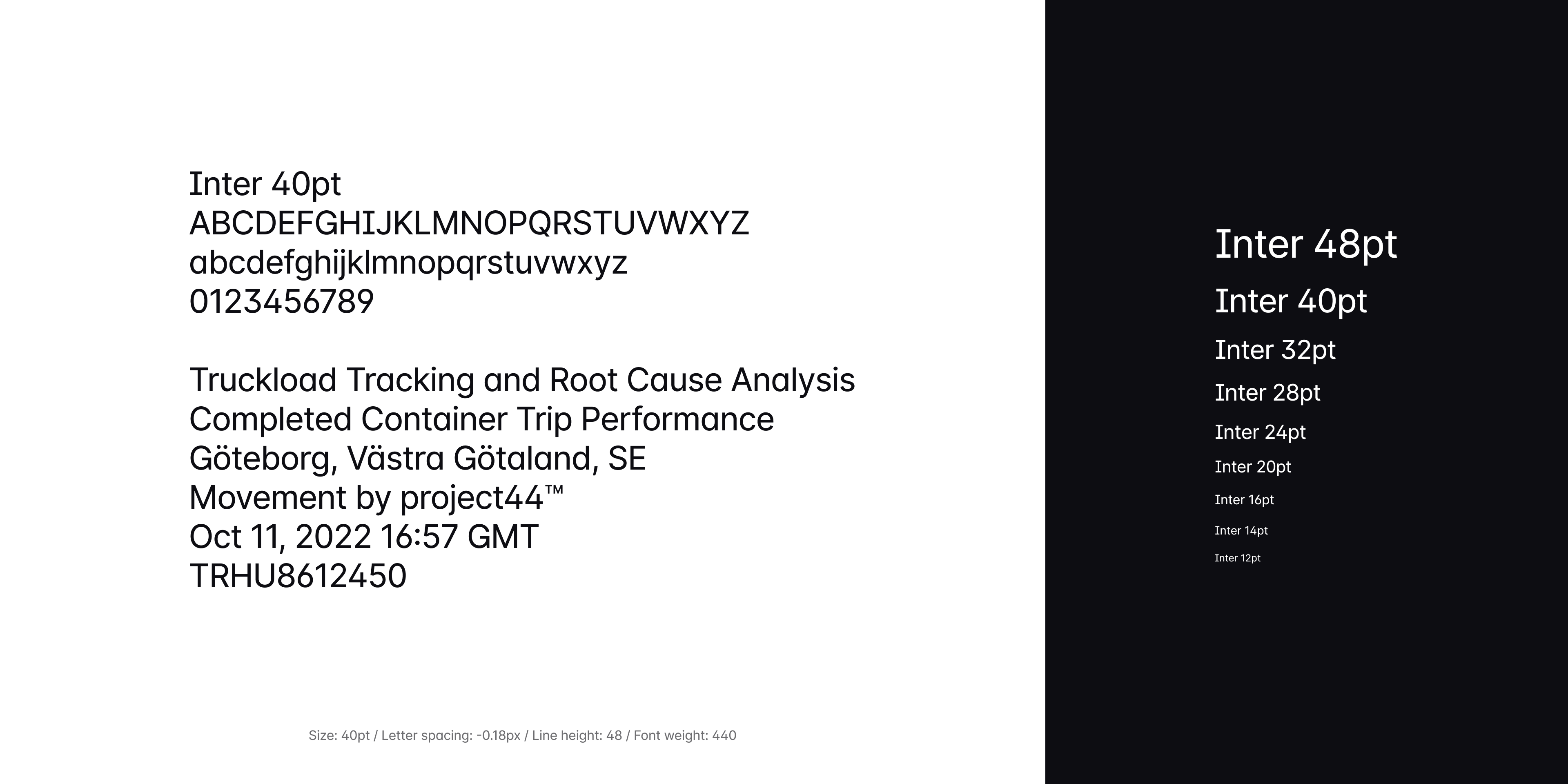
New type scale for Inter ranging from 12 to 48pt.
-
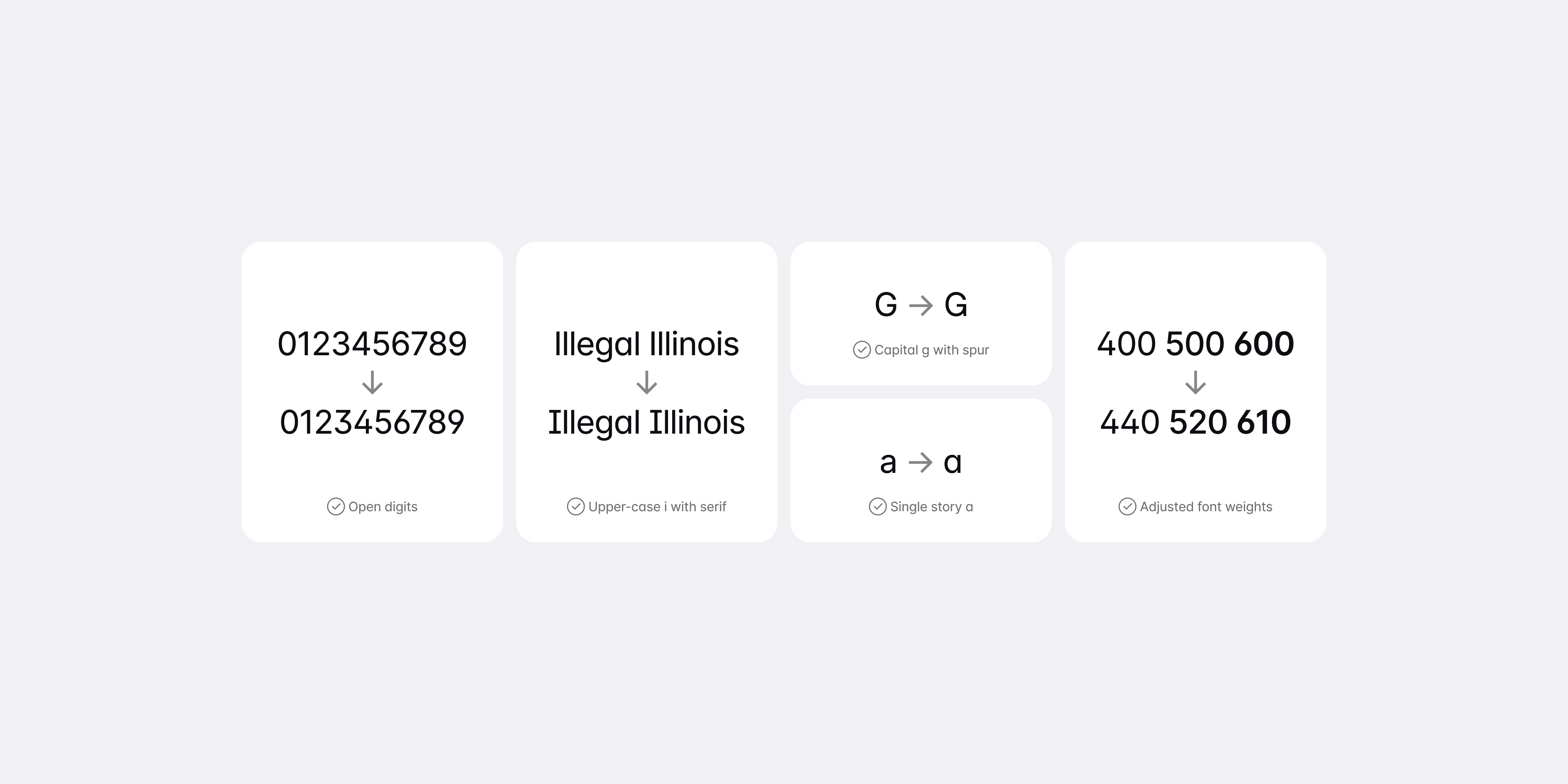
OpenType features and font weight adjustments.
-
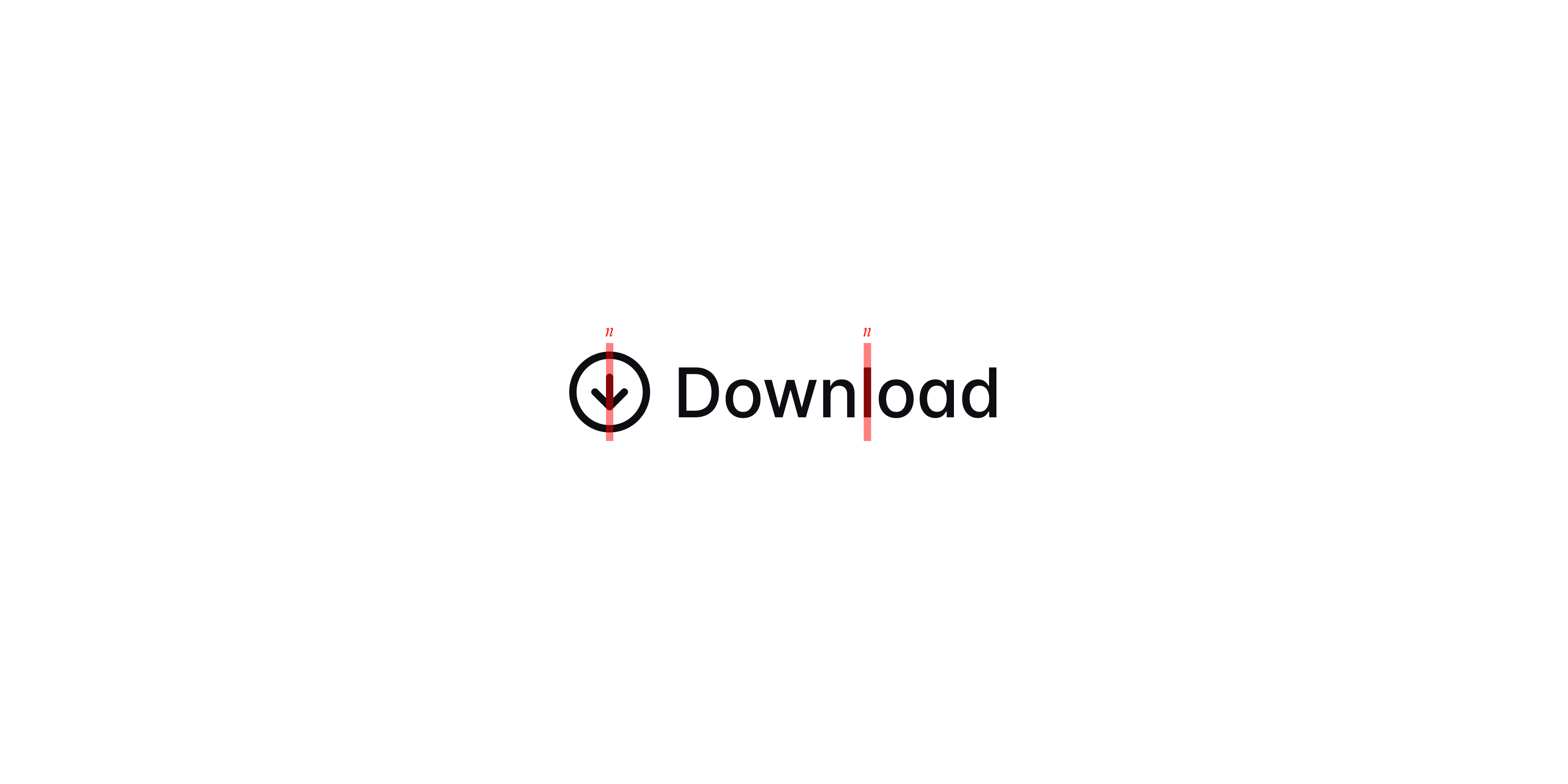
Pairing icon strokes with typographic weight.
Dialing in typography
Movement is a text-heavy application that's packed with tabular data. The team made an excellent decision to use Inter from the beginning, but there was further opportunity to really dial in the details.
OpenType features, like open digits and disambiguated characters, were chosen to tailor the reading experience for small, data-dense content.
Additionally, Inter's default weights were slightly inflated to have more presence on the page. For example, actionable type (like in button labels) is set to 510 vs. 500. This emphasizes the functionality and pairs nicely with an 1.5 stroke icon.
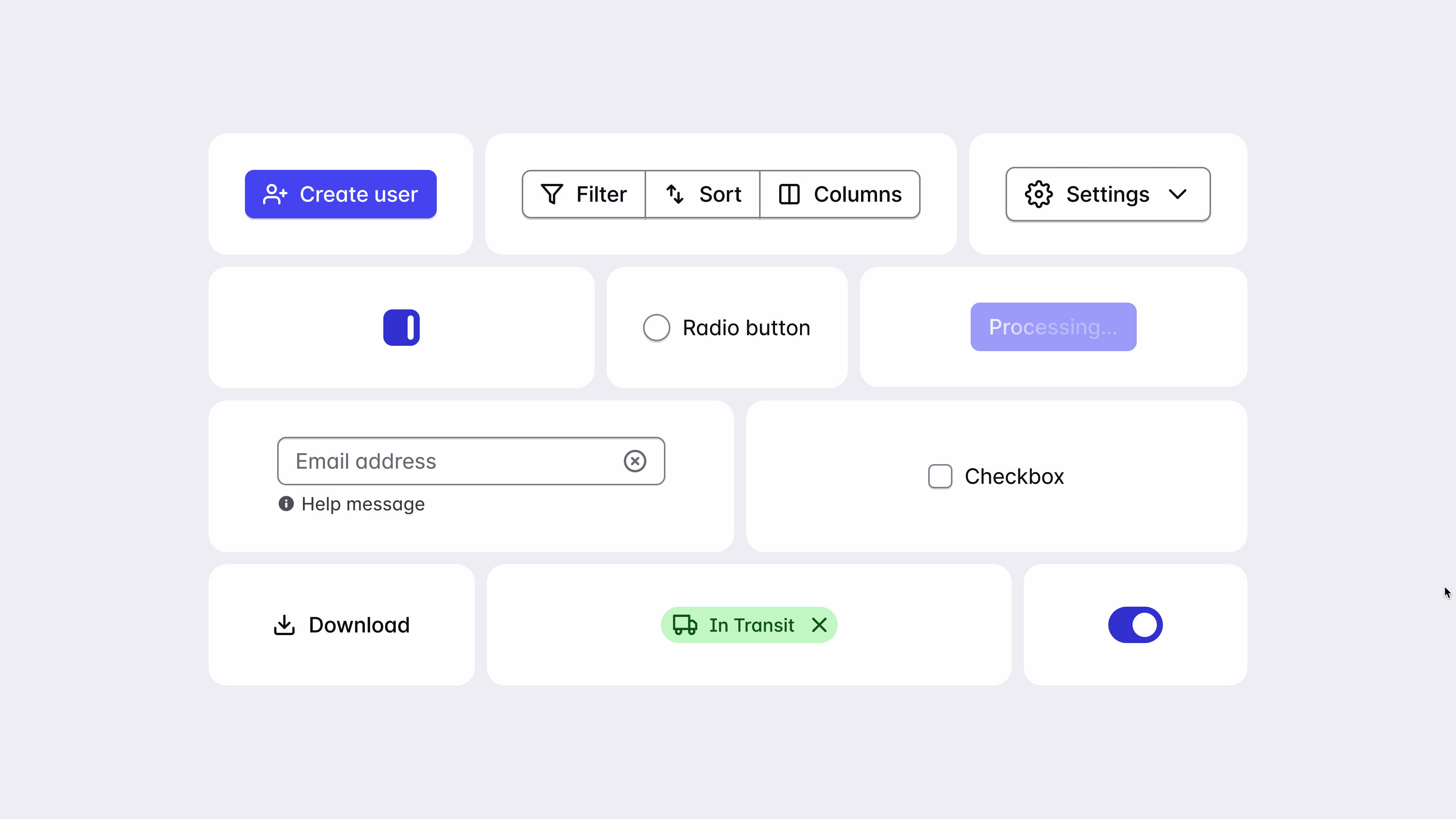
Controls and interactivity
You know how a dog tilts her head when you say something they find interesting? That's how I designed Movement's UI to feel. Always at attention, ready to take a command.
Animations are snappy, never getting in the way of user interaction. Motion durations increase as elements get larger or travel further distances.
-
Movement redesigned: Improved navigation, a stronger typographic scale, and narrow column layout reduce distration and increase scanability.
-
Movement at launch: Heavy drop shadows, full-width containers, and a dark header make this page feel oppressive and hard to absorb.
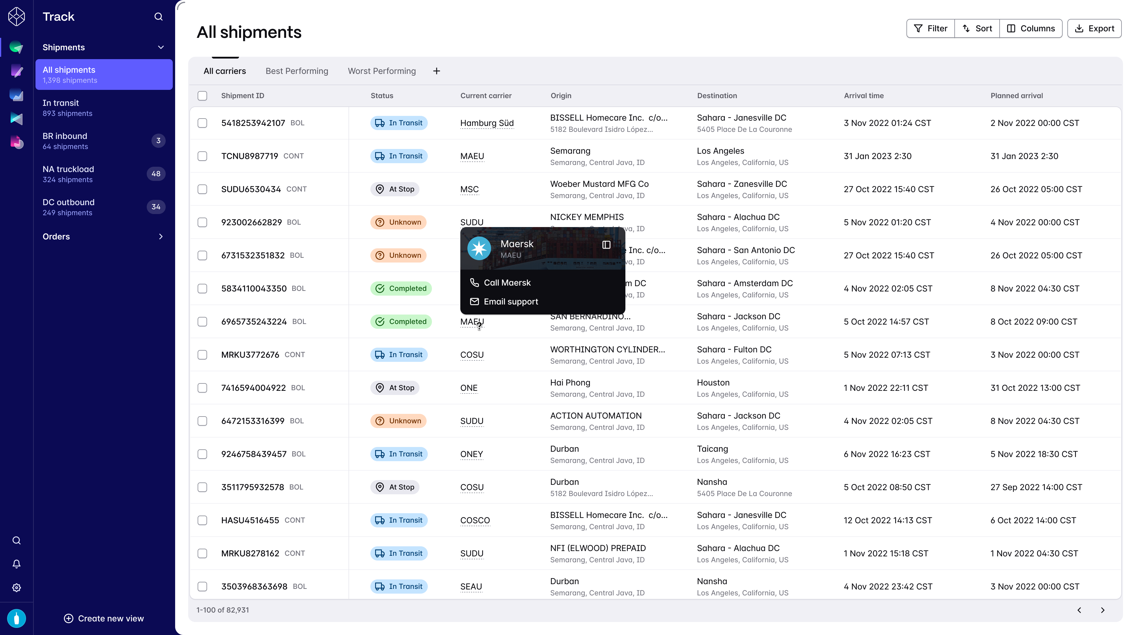
Bringing it all together
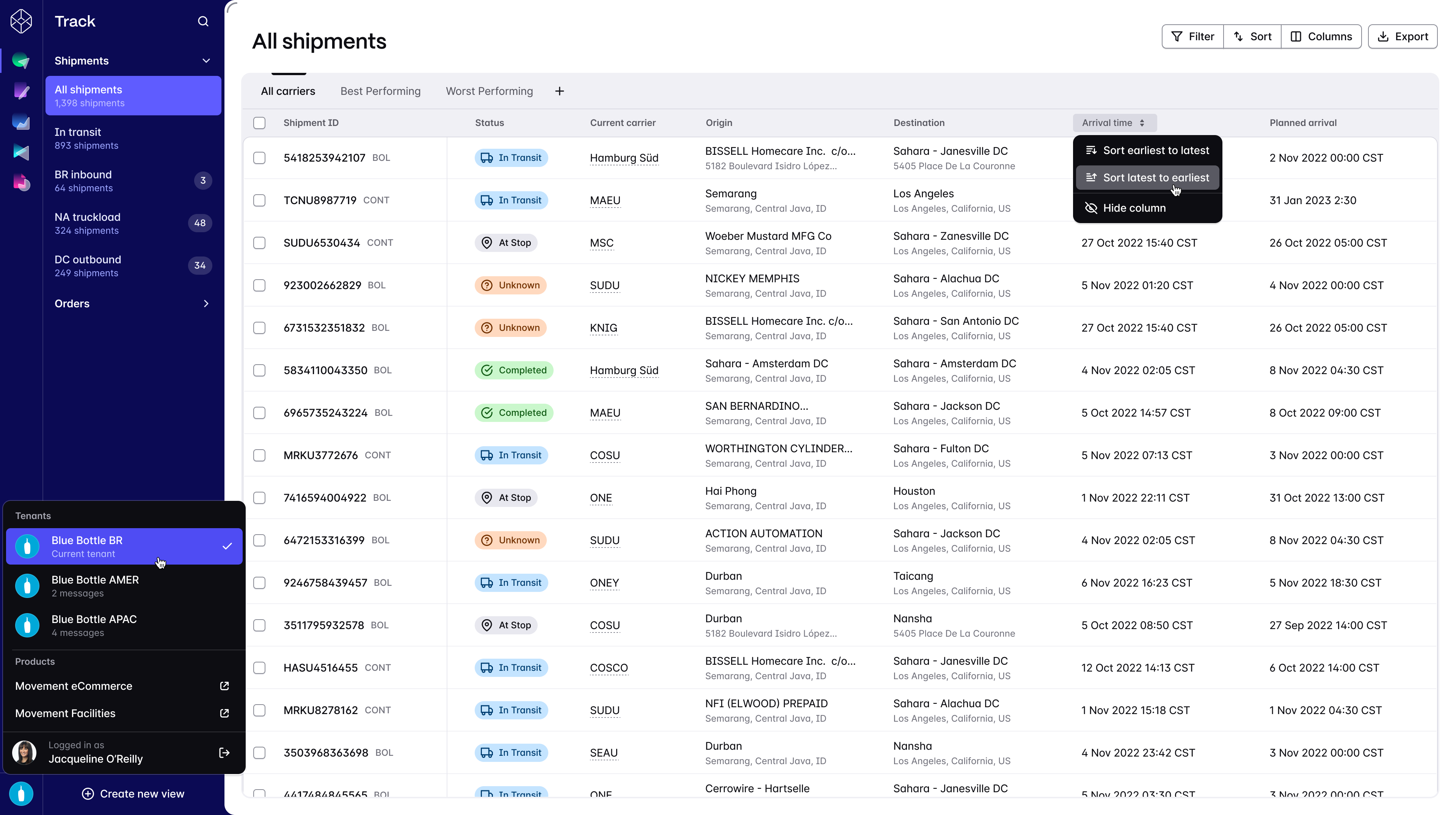
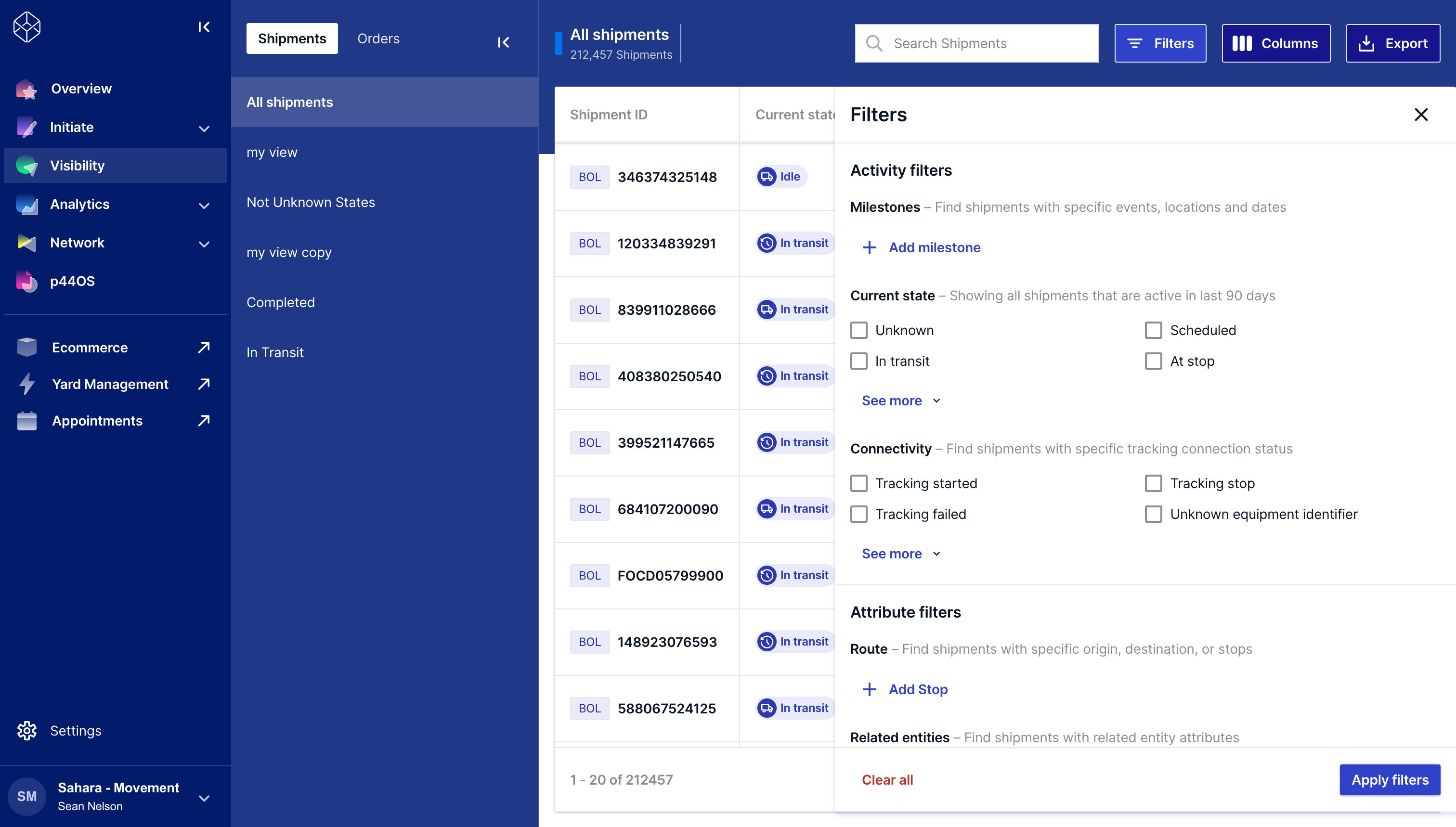
The shipments table in Movement is a cornerstone piece of UI. It's a common destination for many of our customer personas and includes complex customization options, like filters and saved views, and sophisticated data interpretation.
The new design revised navigation with better support for deeper IAs, clearer definition around layout and typographic hierarchy, and breaking content out of its nested containers offers users a more focused and legible experience.